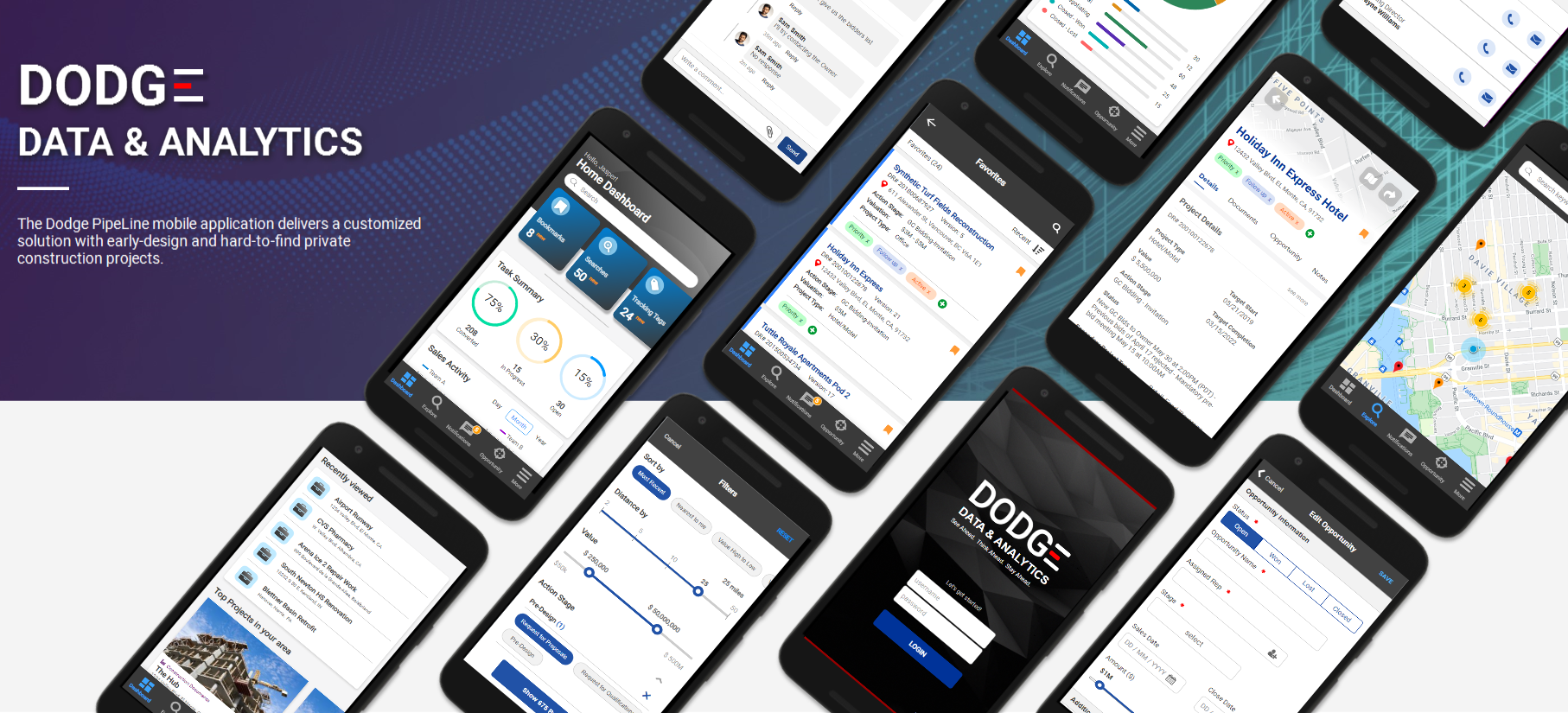
Dodge PipeLine was a huge success on desktop but the mobile version could not be said the same. The current mobile web based platform was initially developed to allow users to access our data system on the go. However, as more customers sign up and use our services, it became clear that we needed to accommodate the rapidly evolving business and improve the user experience on the mobile market. My goal was to redesign the current mobile experience into a content-driven platform for all users.
Setting high-level goals:
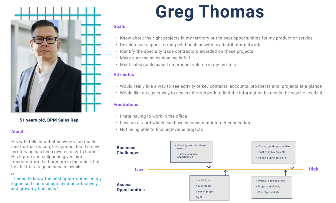
Before I could jump in to designing, I had to familiarize myself with the current workflow and understand what defines success to our customers. These were some intitial questions I pondered over:
I worked with the Customer Success team to collect more information on common customer inquiries to identify the top problems raised. This provideed a better understanding of the working mechanisms and weaknesses with current solutions. Some problems identified were:
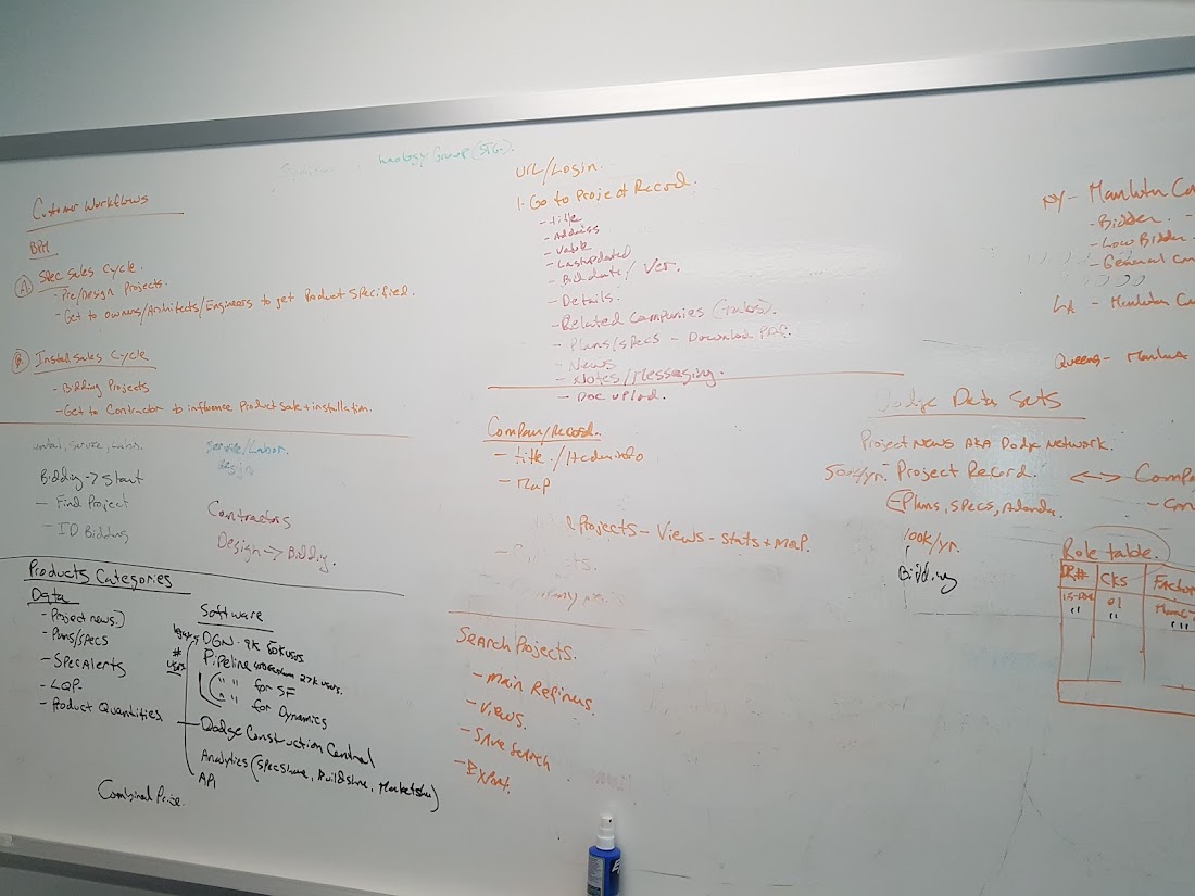
After reviewing over current problems, it was time to learn more about needs and problems of users on a more objective level. Earlier research into user insights really helped shape the direction and focus on the types of questions to ask. I divided the interview into two parts.
The first part was to understand user motivations with a more open-ended structure of questions such as why they use mobile apps, how long they go on Dodge for, why do they use Dodge, etc.
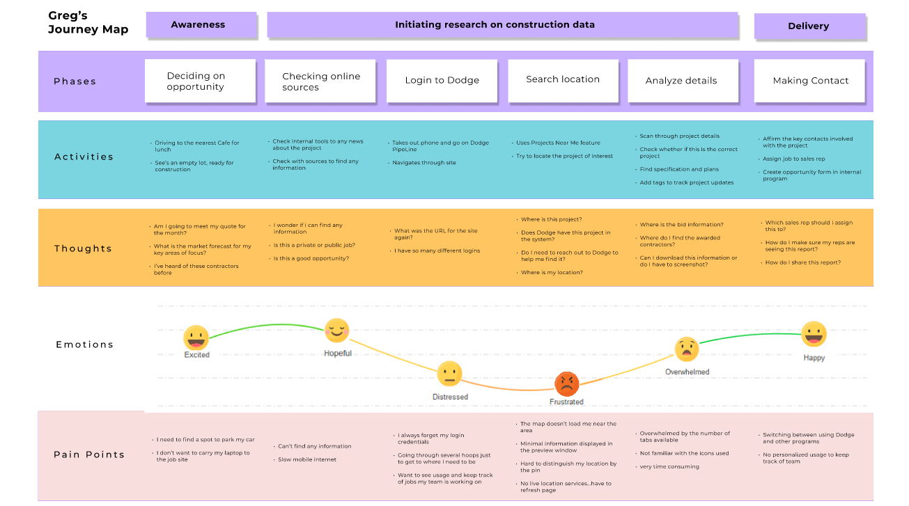
The second part was to observe their interactions with the product through pre-set tasks. All these insights were used to organize the user journey and identify pain points in workflow.
Furthermore, I also checked out the activities users were spending the most time with. The data revealed the average session per user was relatively low which is enough to say users don't spend a long time on the site. Most of these users were spending an extended period of time (average below 5 minutes) between the home page and the project report page. They were also actively using the 'Projects Near Me' (finding projects in your local area) feature but oddly enough, the time spent was short in comparison.
At first glance, this was all expected but it didn't explain why users were still having trouble using the platform. And after some thinking, it became clear that navigating was complex and often forced users to repeat unnecessary tasks. The time and effort spent on these tasks heavily impacted the experience; Dodge did not deliver an optimized path to get users what they need.
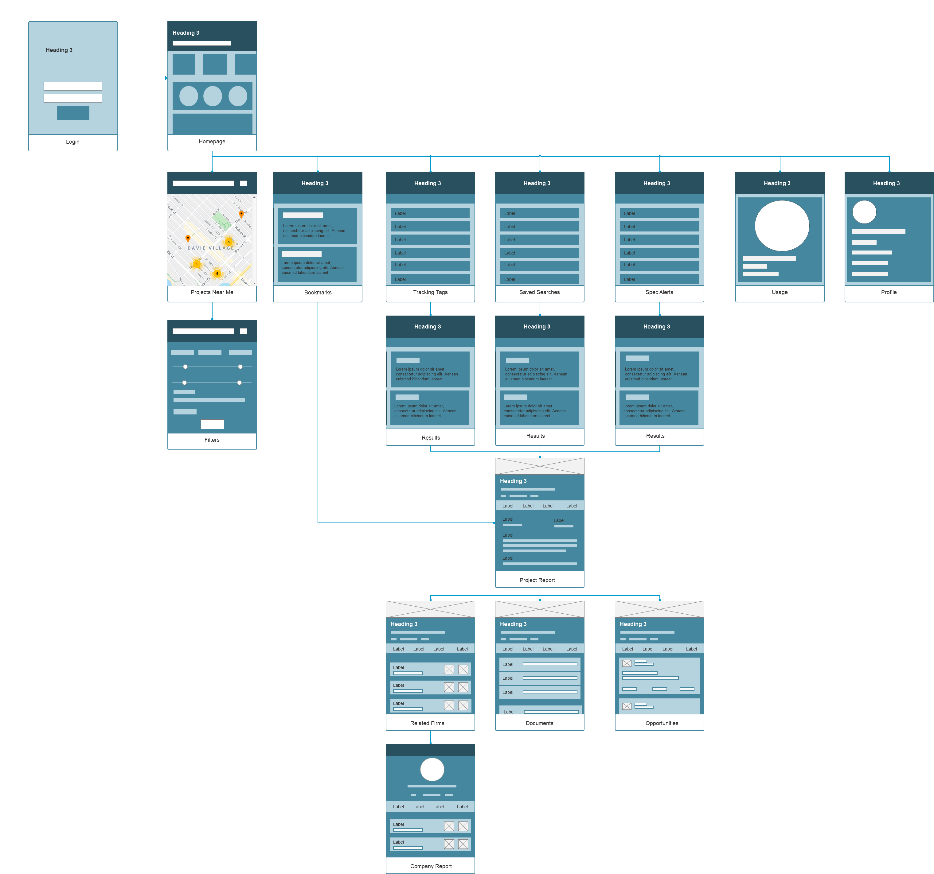
The big forefront of Dodge Data & Analytics is (as the name implies) the set of quality data research on construction projects. Based on the insights from our user research, a common theme was that the data is spread throughout different areas and make it difficult for users to find the information they need. The mobile architecture is vastly different and should pertain to a more simplified workflow with smaller screens. It needed to be flexible to enable personalization of different user roles in different scenarios.
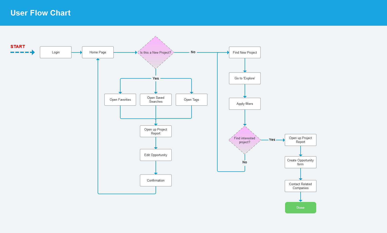
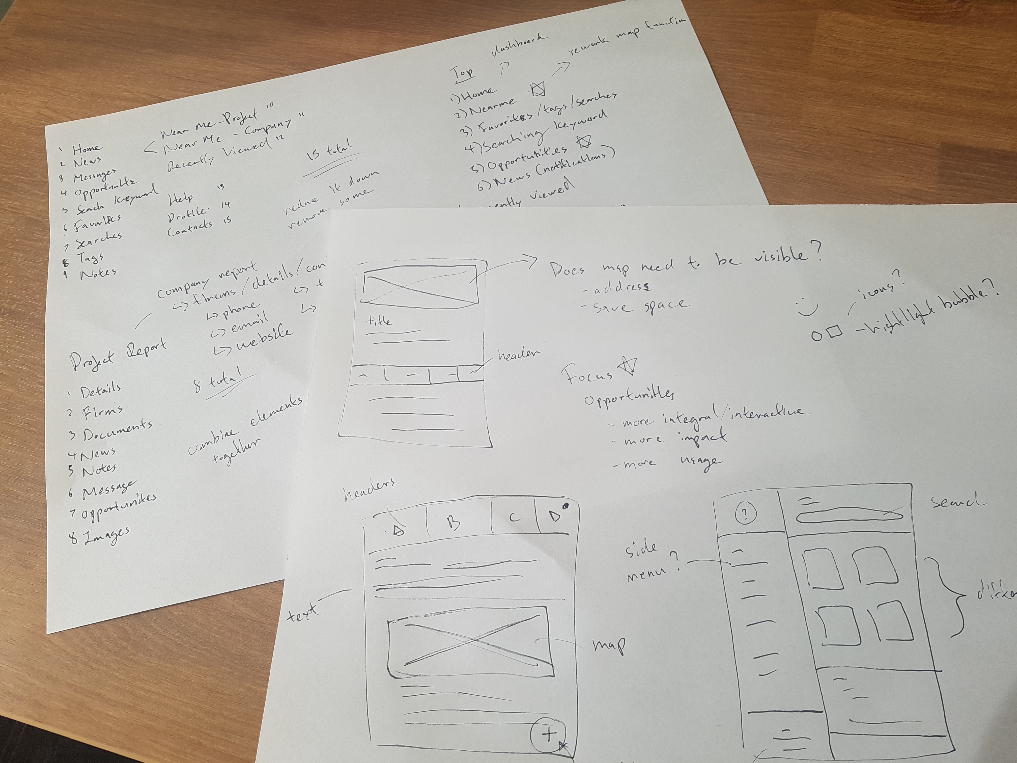
So I set out to explore how to best reconstruct the core app flow with an HMW method of understanding the challenges users faced.
These 3 key design challenges emerged:
1. How might we regularize existing tools to engage users?
2. How might we improve customer workflow and minimize unnecessary steps?
3. How might we adapt and improve map functionality?
Personas were created based on collected data, which serves as a reference point for us to brainstorm ideas off of. The idea was to tackle pain points to improve the user experience.
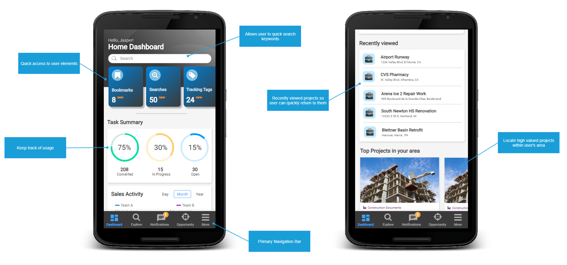
For avid users, the home page is a collection of information to help them track and manage their activities. So what functions do users want? How should it be organized? What information should be available? This was one of the key issues with Dodge; the lack of a personalized Home screen for users to pick what work to do next.
To tackle this, I redesigned the home page to be more engaging and allowing users to interconnect between different entities in a single screen. The idea was to present the home page as a personalized hub to drive engagement and increase usability. It also serves as a beacon allowing users to return back to.
The old Dodge UI heavily relied on a hamburger menu design which end up hiding most if not all features and settings (now I won't get into whether the hamburger design was a good idea or not because that's a whole separate discussion for another day). This proved to be inefficient and complicated. However, it did have its advantages albeit done in a poorly balanced way.
The new redesigned layout is to highlight prominent features in a way that users can quickly access and understand. To balance between interaction and amount of information displayed, I chose the hybrid route and incorporated a primary navigation bar alongside an hamburger menu for secondary items. This allows users to actively engage with key features while maintaining expectation amongst those who are familiar with it. It also helps reduce the number of actions needed to get what they need.
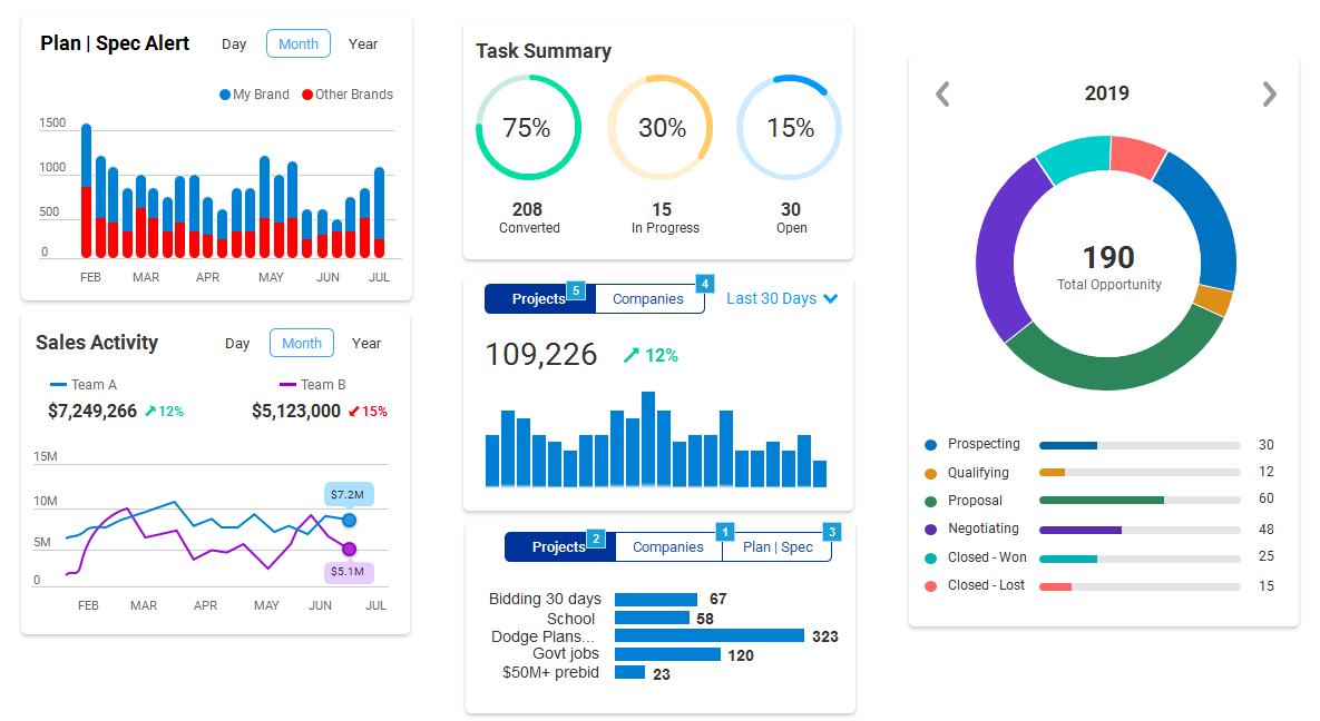
Designing a responsive card layout was fairly simple but there are certain restrictions and rules. Cards must display a coherent amount of information so the user can scan and comprehend the data without necessarily selecting it. It must also contain a visual element pertaining to different graphs and charts to assist the user. I created many different combinations of cards and views through quick wireframes and prototypes.
Since team collaboration was the main feature for this redesign project, many of the cards were focused on this aspect. For instance, there is a card on analyzing team goals and sales, delegating tasks to other reps, spec alerts, etc. The ultimate goal here to increase collaborative efforts between the users and their team to further grow their business.
Keeping track of hundreds of projects in a time sensitive industry can be stressful. Think of it this way - a sales rep may have tens of concurrent projects going on at one time so what does that mean for the Supervisor or Team Leader? It'll be a even greater number of projects to manage.
Previously, there wasn't a way to communicate effectively through the application whether by searching or via available features. Therefore it was difficult to keep track of who is working on which project especially with users having overlapping territories.
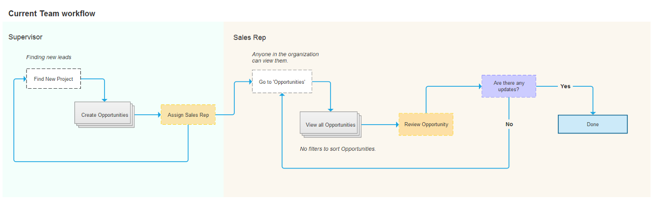
For the app to succeed, it also needed a strong social element by integrating more community-based efforts. What better way then, to add role-based classes around their internal team hierarchy. Now the focus shifts over to the sales rep where they can do their job more effectively. It allows them to dig deeper into project data such as products specified which in turn, can influence the contractors involved. Thus updating the project record and notifying the team resulting in a more collaborative work cycle.
This effectively redefines the core flow to which sales reps can actively engage with their prospects. Also, both low and high-level management can better prioritize low hanging fruit in a timely manner.
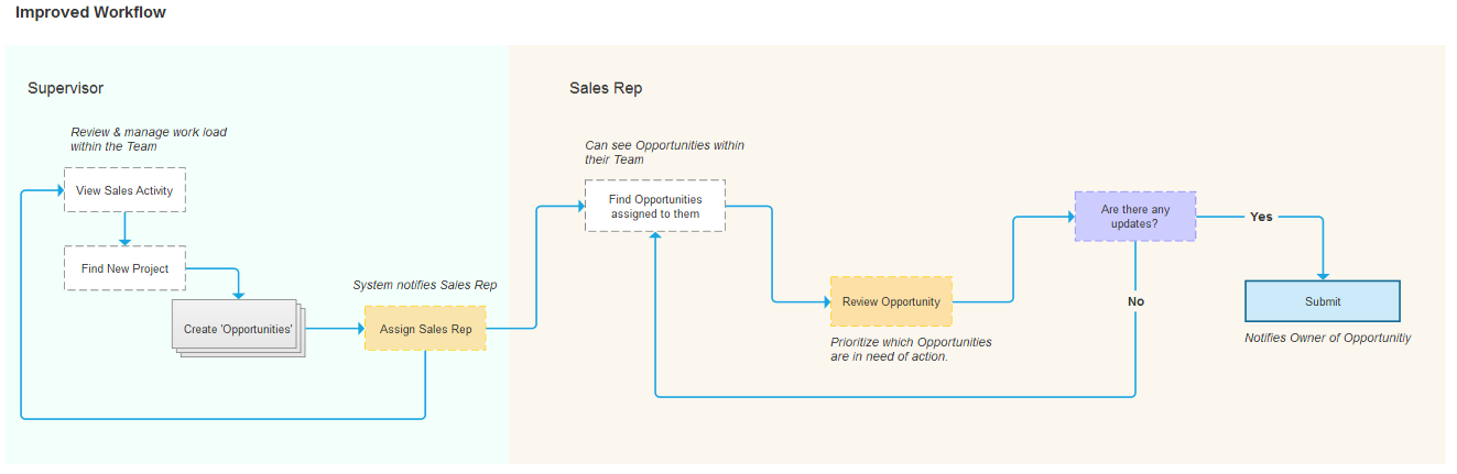
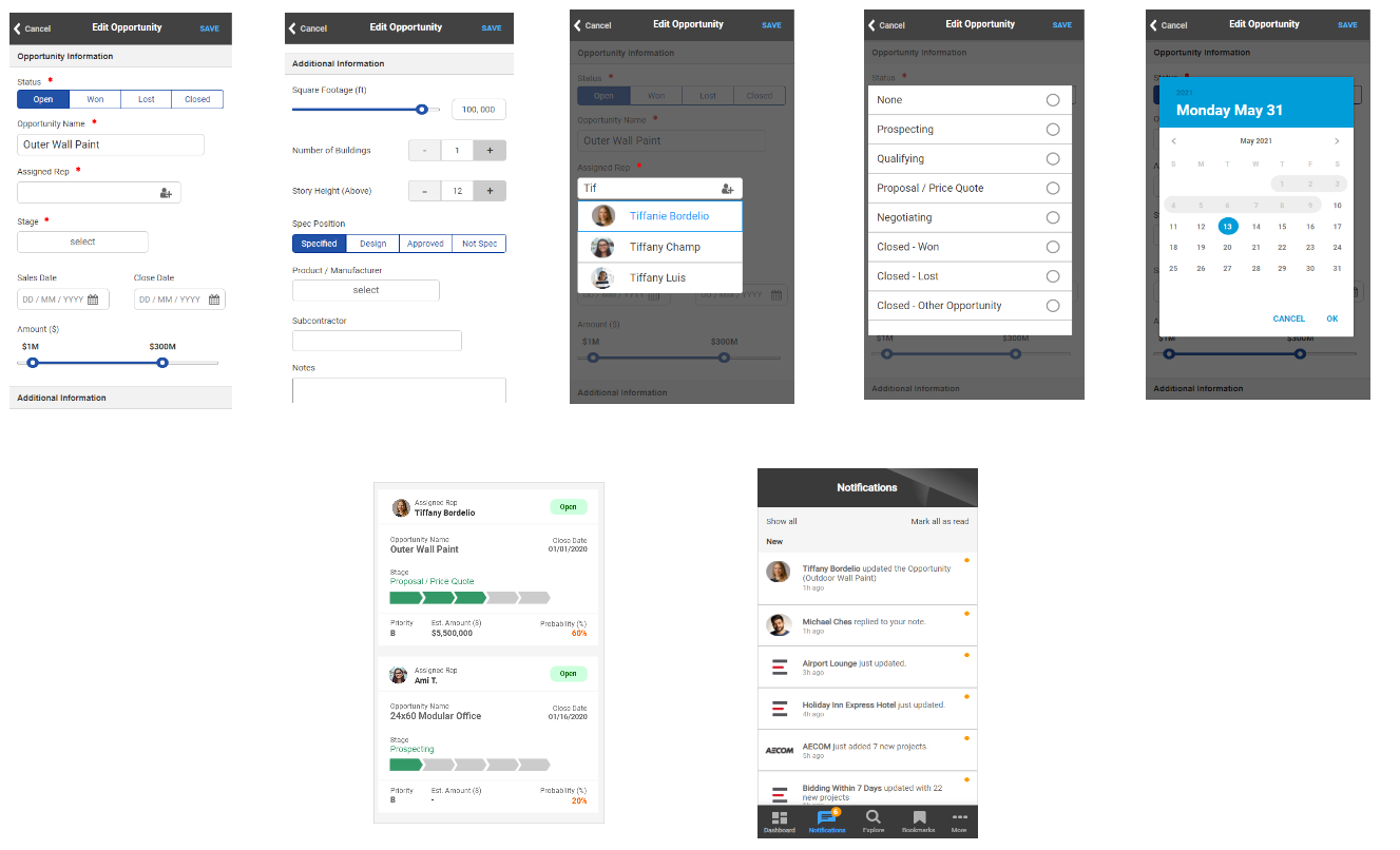
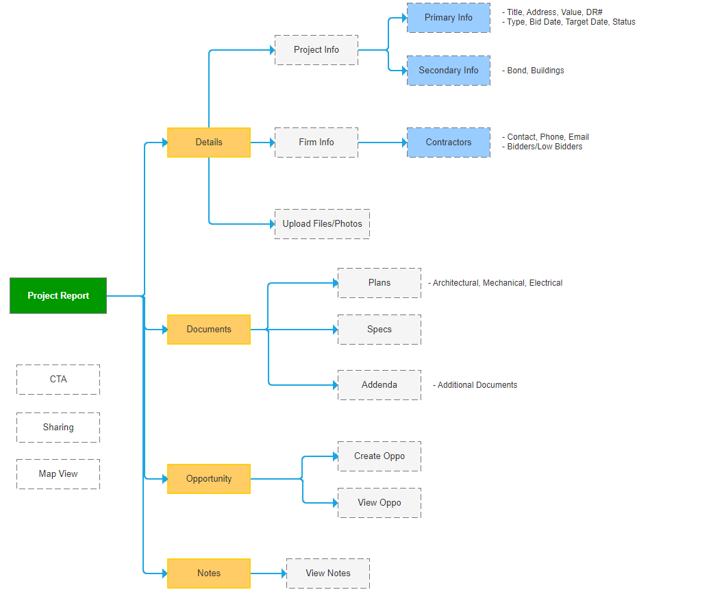
There are two parts to this problem; one being the complex structure and second being the amount of data the user must consume. A key design challenge to this was to consider what types of information to display to the end user. With the help and knowledge provided by the account managers and sales, we were able to trim down and combine pieces of data together for a simpler layout.
I also replaced the current design with a tab structure with each section consisting their corresponding collection element. Vital information are now visible with a quick glance while secondary information can be hidden behind a button; easily accessible to the user if need be. This new layout provides a sensible format to help minimize clutter and increase white space.
Icons are great. They can convey ideas quicker than words and can save space (very important for devices with smaller screens) but only if used correctly. In the case of Dodge PipeLine, it actually hampers the experience and forces the user to perpetually think about what each icon represents.
Instead of relying on icon for visual cues, I opted to go with text labels. This should help reduce anxiousness from users and increase their response times. I kept the use of icons for more CTA-related buttons such as sharing, email, map, etc.
.gif)
.gif)
A key foundation in promoting Dodge would be location services. In order to build confidence amongst users to justify using our product, I did a bit of digging into other map-related services and came to the conclusion that Dodge was missing live GPS and/or location. With real-time GPS, users can accurately locate where they are while they are on the road without having to refresh the page to grab their latest location.
However, I wanted to take a step further and create a better user experience. So what is better than live GPS? The answer was to add directions/navigation to the designated spot. This alone comes with several challenges but for early adoption, we can redirect users to Google API map services to achieve this.
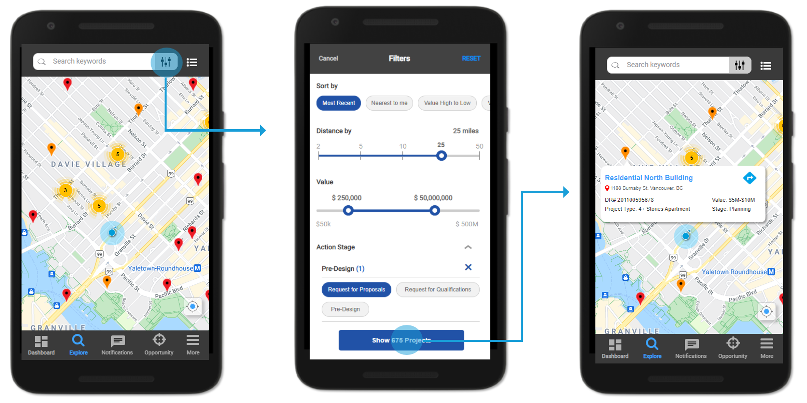
In order to verify the effectiveness of the new redesign structure, I needed to test clickable prototypes with some live users. The users included customers and internal employees for usability testing. Overall results were positive, where all users can now easily find projects through the "Explore" navigation tab. Users were also spending less time navigating through screens and getting through more projects based on task completion time. However, there were other challenges that arised which I overlooked in my first iteration:
Problem - It was difficult to determine if the user has viewed the project or not
Solution - Add a ‘Viewed’ indicator bar to the side of the project (similar to Outlook)
Problem - To be able to customize Opportunity forms with different fields
Solution - Since each client has their own workflow with different definitions, we needed to incorporate customization but maintained by us.
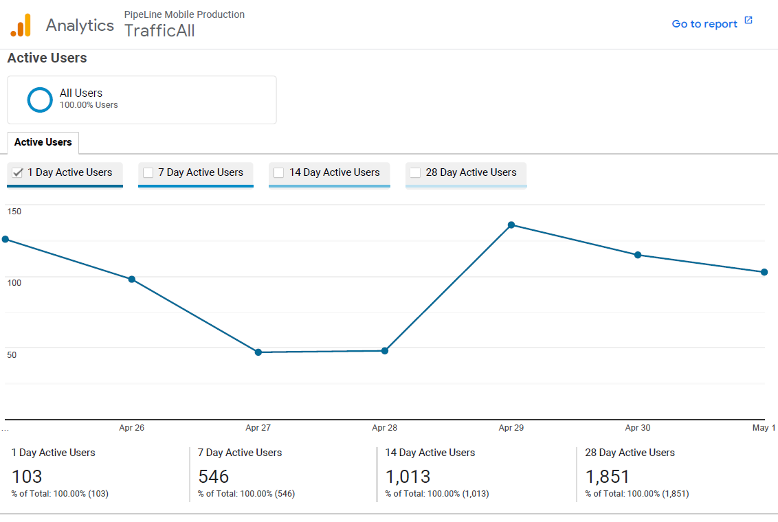
As shown earlier, the number of active users using Dodge mobile pales in comparison to the total amount of users using Dodge desktop. There is an untapped potential to increase revenue and improve retention rates in the mobile market. The project is still ongoing and will require further rounds of testing before release.
I do have some future plans in the works including:
If you like what you see and want to work together, get in touch!
jeff.cylaw@gmail.com