One of the main features of Dodge PipeLine is to find construction projects within North America. There are over 3 million projects archived in the system readily available. And, with such a large database, we in turn have dozens of filters available to help our customers drill down the data to target potential leads and grow their business.
However, we found the process to be too complicated for beginners especially those with little to zero knowledge of computers. Thus, i was tasked to help in designing a new feature called, "Basic Search". The central idea was to enhance user interaction with simpler processes while maintaining the core design intact.
My goal for this project was to:
With a new feature, comes with a new workflow but where do we start? We needed to redefine ways to gravitate users towards our product. This required a big shift in design which would ultimately shape up the user experience.
Following inspirations from Zillow and Redfin, we decided on a new approach to user-centric designs; by proactively pushing data to users rather than reactively have users find what they need. Not to mention a handful of users might not even know what they are looking for. This completely changes the dynamic role Dodge has maintained, where the responsibility was laid on the customer to take the initiative.
Rather than blindly blasting users with all sorts of project data, we can setup constraints to tailor to each individual. This will limit the number of choices our users can choose to act upon. By defaulting a pre-determined set of parameters, we can build confidence in our users to discover potential leads.
Furthermore, by scripting a specific pattern or path, we can significantly improve performance and server stability. It is much quicker to process queries on a smaller set of pre-filtered data than untethered data from the server.
Arguably the most effective parameter would be geolocation, in other words, the customers local market area. For example, if a sales rep was stationed in Toronto (Ontario), then they wouldn't care about projects going on in Los Angeles (California). The interest would lie in projects in the local vicinity and building relationships with the contractors nearby instead.
However, location services can often err or return bad data especially with users with high security protocols. To account for this, users can enter in a location manually if for whatever reason, the system was not able to perceive the users network location.
There are over 30 custom facet filters available on the service. While more filters does offer greater versatility, it can tunnel vision and end up with lower than the desired number of projects in return. This can cause some frustration when users are not able to find what they are looking for because their query was far too specific.
We need to prioritize brevity and reduce unnecessary content. Taking in consideration to visual hierarchy, scannability, and ease of reading, it should provide just enough information to the user to be able to make a decision whether to continue with the prospect.
After establishing the fundamental concepts, we were ready for the next step: designing the overall layout.
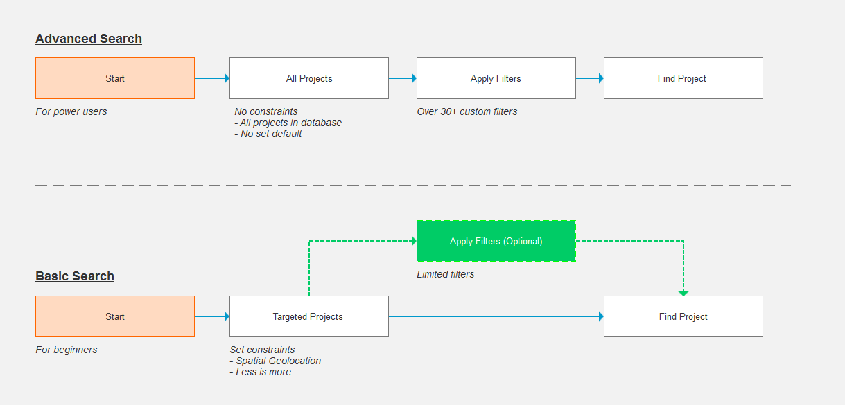
In an effort to prioritize content and spatial geolocation, I decided to go with a partial map layout. But what is a partial map layout? It focuses neither on content or geolocation exclusively, but strikes a balance between the two. It allows content to be delivered side-by-side with an interactive map that notably complements each other.
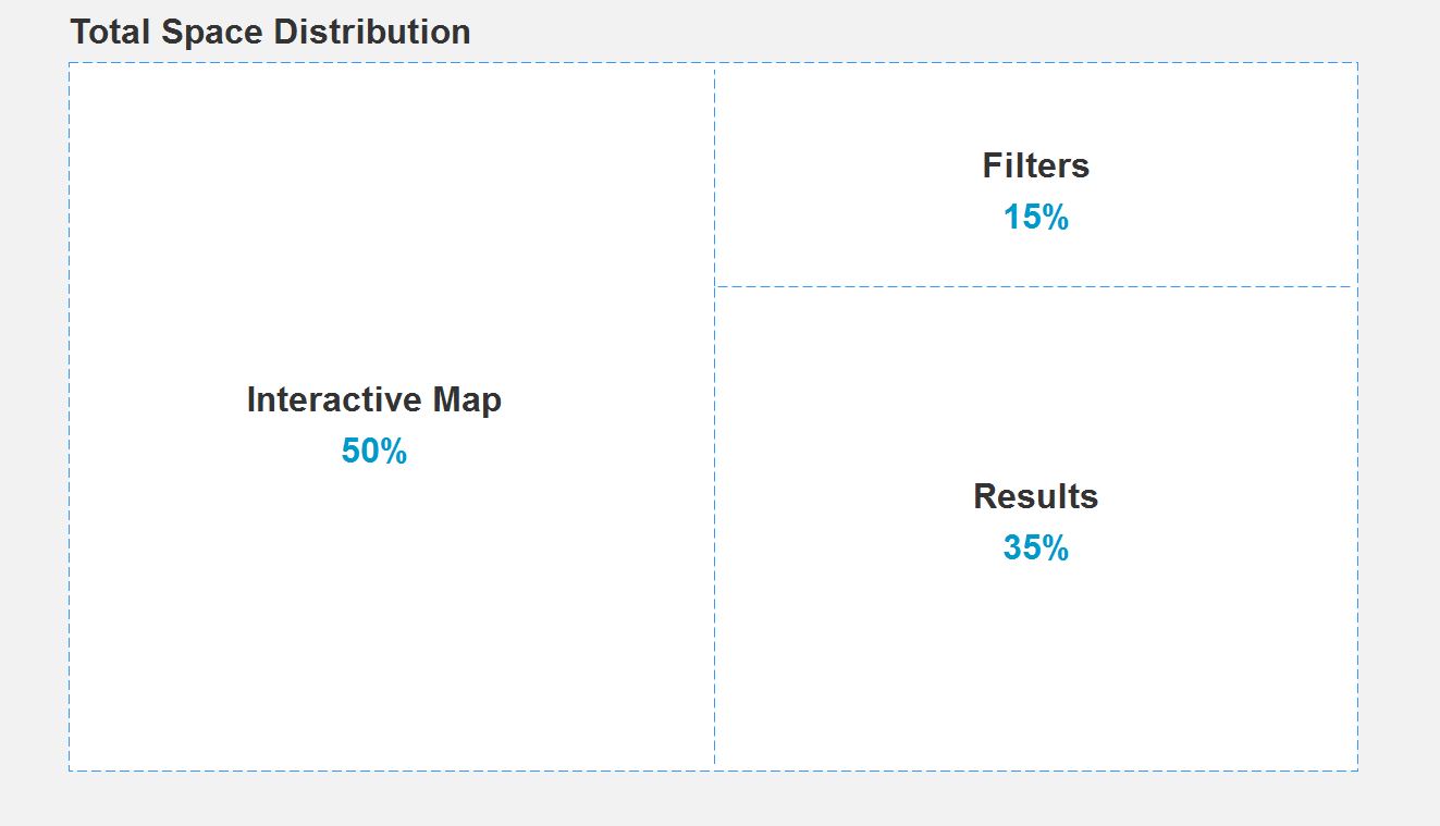
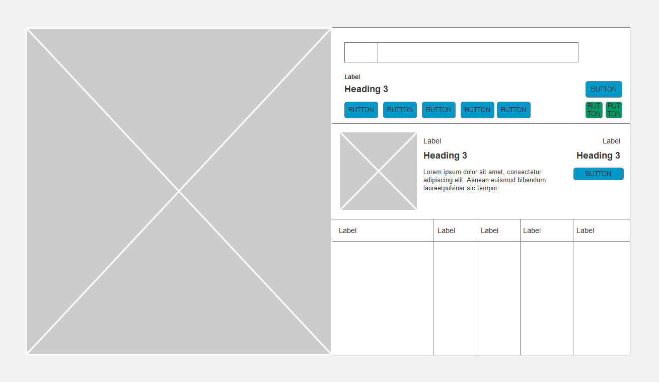
But how do we decide what the actual layout will comprise of? Should the map be center-aligned or should the content be displayed first? We tested the interactive experience through a series of A/B tests created with mock data. The consensus after testing was that engagement was highest when the map was aligned to the left and content to the right.
Continuing with the visual hierarchy from left to right, comes top to bottom in priority. High-level filters are placed at the top with the corresponding results directly below. This change in dynamic should improve the user experience by quickly defining the available search parameters.
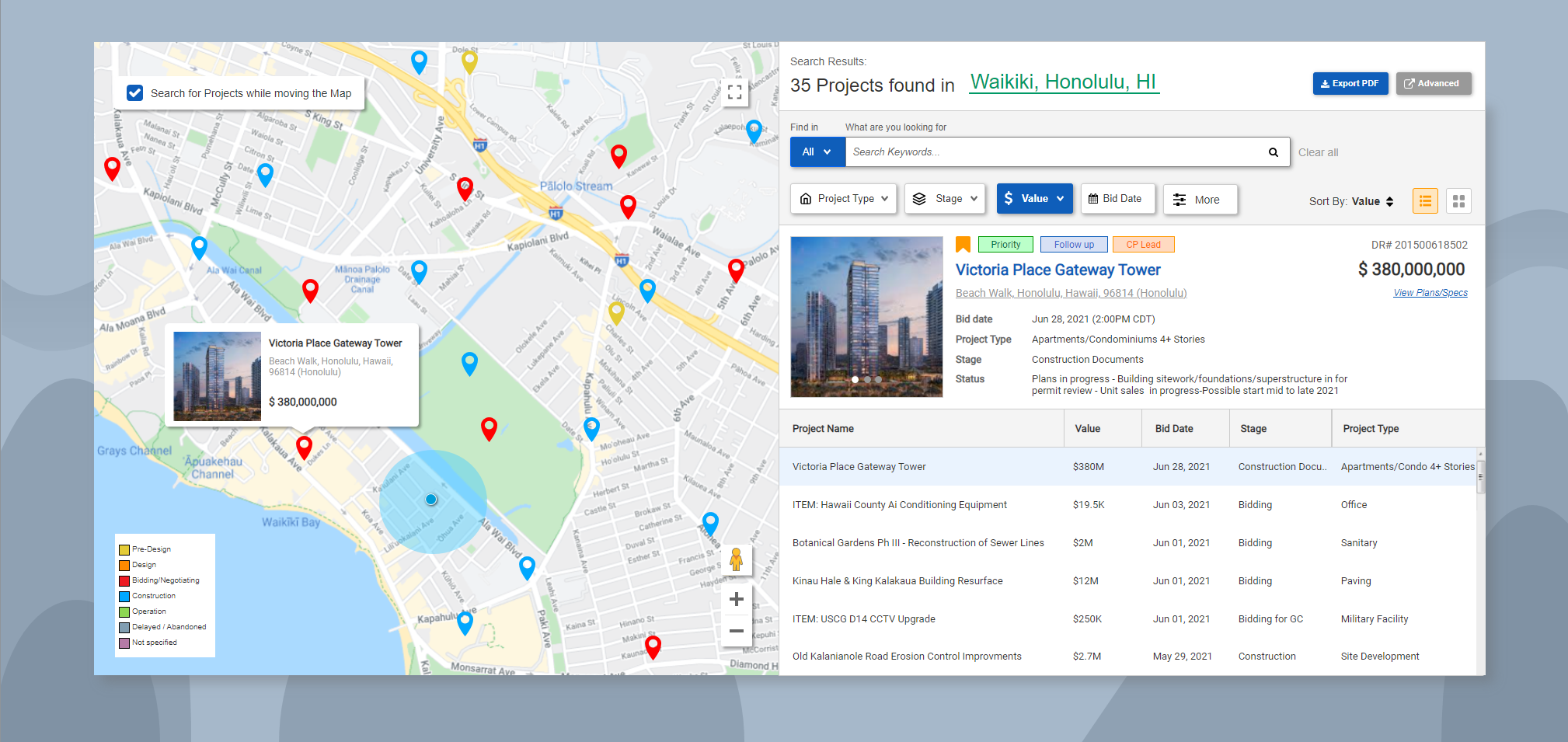
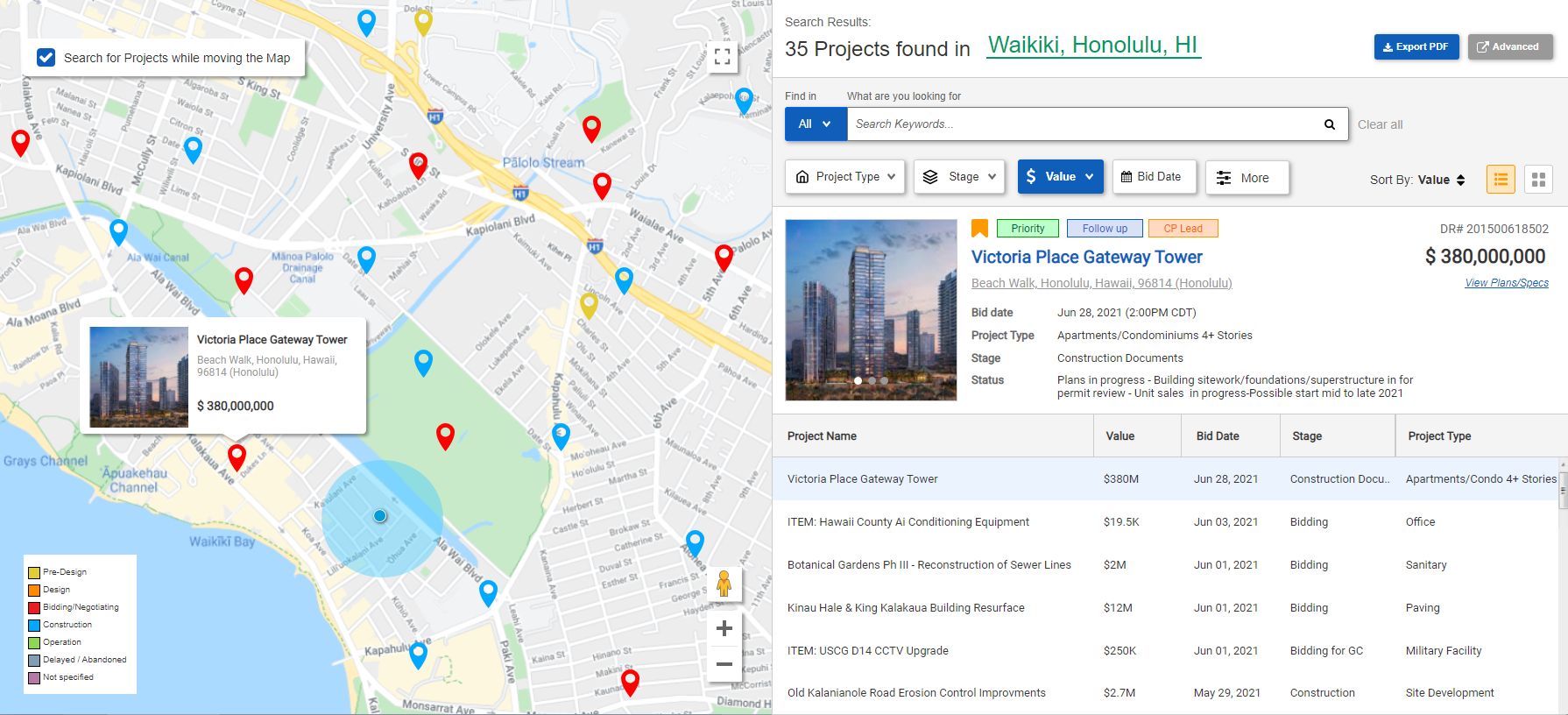
By incorporating Google Maps API, we can offer customers the full features available with using their responsive map design. This increases user engagement by allowing users to visually identify projects and take the appropriate action. It can also help users discover additional information based on the geographical location or streets they are familiar with.
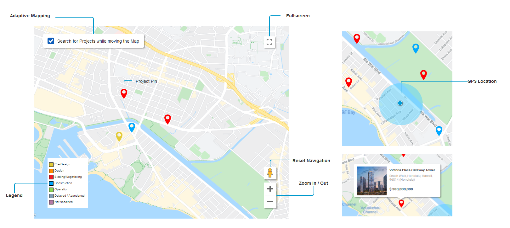
But what happens when multiple projects occur in the same area? To reduce overlapping between projects in high density areas like in central Downtown for example, we used clusters. Clusters are formed by a small group of data nodes represented by a total number. When a user clicks on a pin or zooms in, the cluster will seperate and display the individual pins.
.gif)
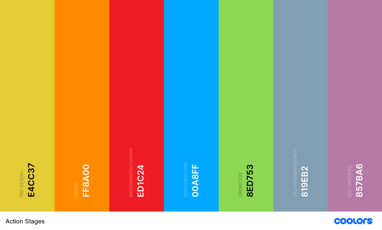
To further optimize the experience, we added color-coded pins for each project. There are 7 distinct colors available and each one represents the stage in where the project is at - Pre-Design, Design, Bidding, Construction, Operation, Delayed, and Not Specified. This extra detail will help users identify projects quicker.
As mentioned earlier, the amount of available filters can be overwhelming to the user. To continue on with the direction towards minimalism while maintaining efficiency, we needed to rework which filters should be accessible. But how do we know which one to keep and which one to remove? A good set of filters should be relevant to the user and their business. Through research (ie. card sorting method to rank filters) and feedback from other teams, we isolated a few set of must-have filters pertaining to most customers.
So, that's great we got the key filters down. However, we needed to solve another use case; searching for specific projects. Often than not, customers already have projects in mind that they've heard about and need to find further information in Dodge. Rather than have the user go through loops applying the filters above, we included a keyword search to easily overcome this.
It can search against various data fields such as name, address, documents, etc and return relevant results. This allows the user a wider range of tools to find the project they need with the available information they have.
.gif)
We have the action, now we need the reaction. How do we present the data into a readable format?
From customer feedback, the list view and grid view were the most favorable choices out of 5 categories. The list view was optimized for reading comprehension and drives a natural reading pattern. And, the grid view had a strong visual appeal and firm segregation. I decided to implement both formats so customers can analyze the data through different perspectives.
The next task was to condense the amount of information displayed. At a minimum, it needed to align with the filters so each parameter in part was required. Users needed to be able to identify which project matches the filter criteria; there are no one-size fits all condition. Numerous reiterations were meticulously crafted to find the perfect balance between content and white space.

After iterating design prototypes, we needed to verify the efficiency of the new feature. We ran a pilot program with users who have minimal usage and observed their interaction on the product. We also asked questions afterwards for any feedback on the overall experience any frustrations they might have. Here are some challenges we found:
Problem - The proximity search was displayed within the Map and blocked parts of it.
Solution - Moved the proximity search to the top right-hand side above the filters.
Problem - Users wanted to know if the project had documents available without having to click in it.
Solution - Add quick links to documents that will be event based so it will be displayed if documents are available.
Problem - Is there a setting to bypass or skip the 'Basic Search' and use the Advanced search?
Solution - Add a preference setting to default the landing page
Although the final design was comparatively different, many of the core design aspects were an integral part of the final product. With the release of the feature, there was a positive impact on customer experience which lead to an 18% increased interaction between the user and Dodge. This includes a higher retention rate as more users get exposed to the new feature and start using the system.
Instead of pushing away customers because it was too complex to use, now more users can benefit from our search tools. This fits with one of our primary goals to build awareness and increase accessibility to a wider audience. More importantly, to get the user started with using the product and getting to know Dodge.
If you like what you see and want to work together, get in touch!
jeff.cylaw@gmail.com