.png)
It's difficult to overstate how much the pandemic has devastated airlines and the aviation industry in 2019. As the industry slowly recovers, they struggle to keep up with demand; making it difficult to scale alongside the rapid influx of travelers due to lifting travel restrictions.
Ongoing issues continue to accumulate so system transparency and resource management was more vital than ever to keep the terminal running smoothly. Our clients desperately needed smarter and more efficient ways to prioritize critical issues and maintaining system performance.
United’s sortation ecosystem had evolved over decades. Each hub operated with different versions of software, siloed dashboards, and limited visibility beyond local operations. Some locations had not been upgraded in over 10 years, creating usability gaps, inconsistent data access, and operational risk.
From a design perspective, the challenge was to:
As with any design process, I began by conducting research - qualitative surveys, user interviews, and observations. I sought to understand what data our platform needs to perform successfully and how our users utilize that type of data to solve their imminent problems.
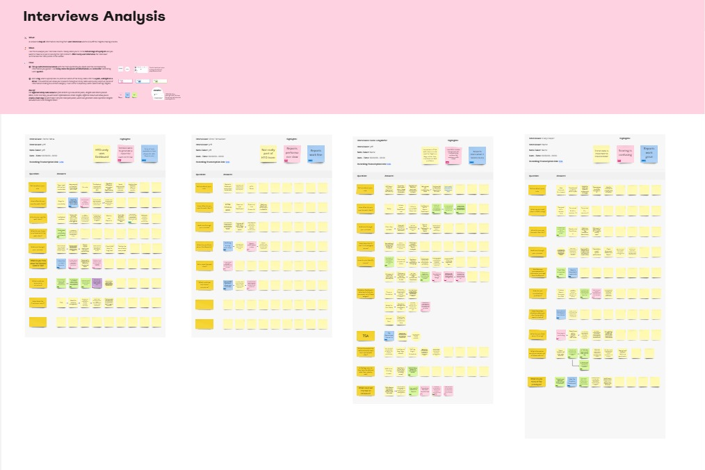
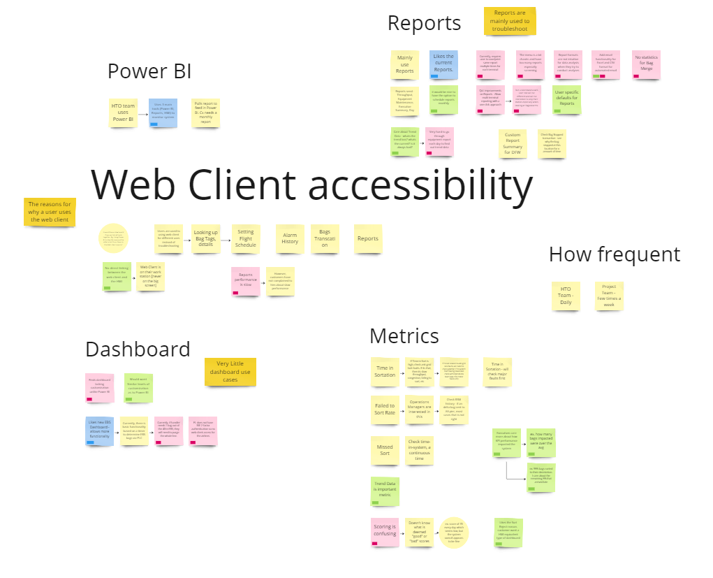
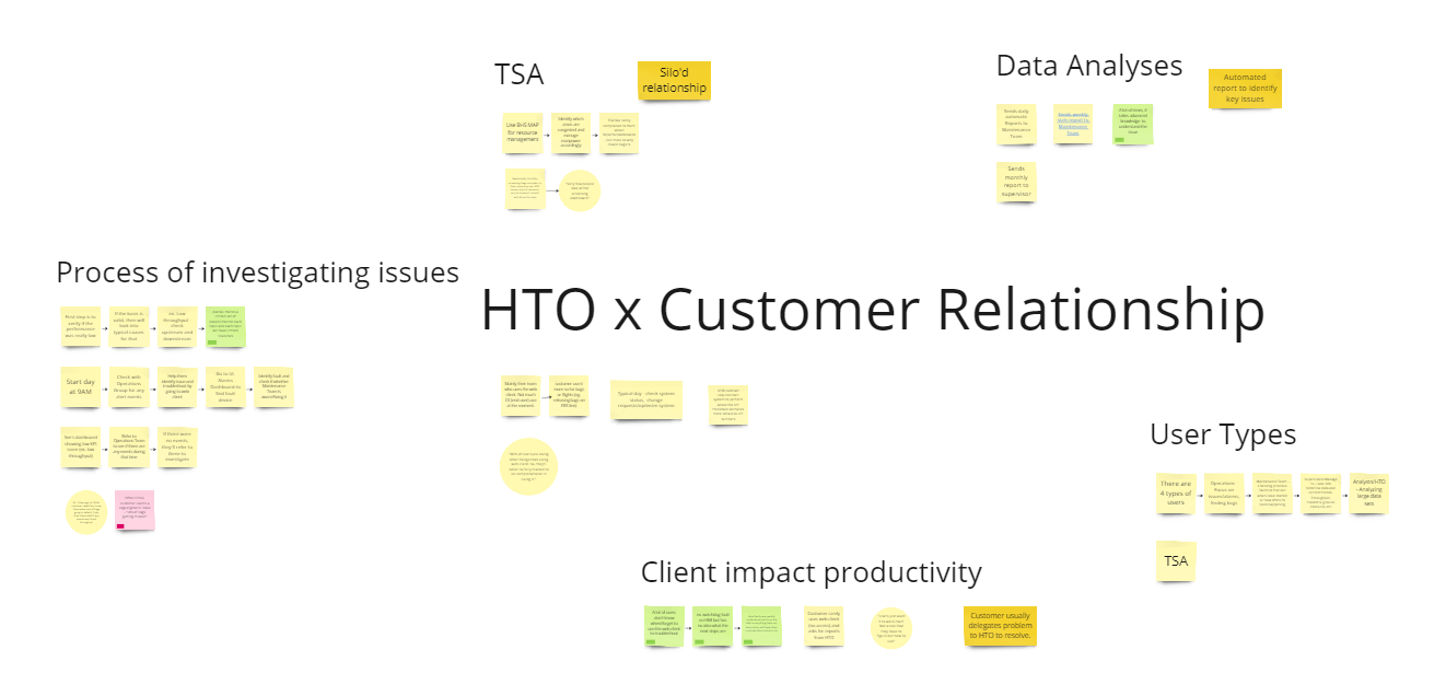
The focus for the exercise was mainly to group and prioritize similar interests and define their baseline for a healthy system.
Similar points of interest:
1. Dashboard is rarely used and most users will go directly to the Reports for analysis work
2. Some Key Point Indicator (KPI) metrics were more important than others
3. Access to historical data is essential for diagnosing issues
Similar pain points:
1. Navigation flow is confusing for new or less experienced users
2. Lack necessary customization options, limiting individual workflows
3. No simple way to view multiple airport stations at a glance to prioritize issues
In summary, dashboard usage were typically used by executives or operation managers to get a holistic view of system performance, focusing on key metrics, trends, and anomalies. However, the real problem-solving happens within reports where maintenance and HTO teams can analyze the underlying data, identify root causes, and take action.
Recognizing the gap between high-level insights and in-depth problem-solving, the next step was to rethink the UI to better support both workflows.
How do we implement a solution to solve these pain points? What layout was best to increase scannability? Can we identify issues within a few steps? Can colors be used to guide attention and creating hierarchy? These were some questions I had in mind.
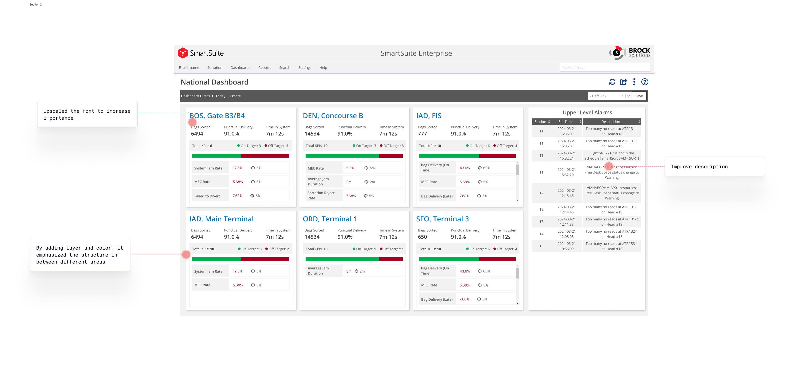
Previously, the dashboard relied heavily on a tabular data format, which made it difficult for users to quickly identify trends and critical issues. Rows of numbers required additional effort to scan and interpret, slowing down decision-making. To address this, we took a step back and refocus on the idea of dashboards being high-level insight tools; making use of card tile design to isolate different sectors.
To ensure the card tiles effectively address immediate issues, we took a deficit-based approach—one that highlights system weaknesses rather than just overall performance. This helped users quickly pinpoint problems and prioritize resources for resolutions. The user research reinforced this need, revealing that teams required clear, actionable insights rather than a complicated color scheme.

2.png)
We initially played with the idea of having 3 primary colors representing what is good, bad, and warning similar to traffic lights and other performance monitoring systems. However, we noticed that usability was much lower when we added extra cognitive variable, making it difficult for our users to prioritize more critical issues in a timely manner.
%402x.png)
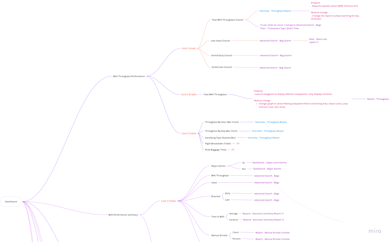
A big problem for our users was the lack of cohesive flow creating a fragmented user experience, primarily due to the overwhelming number of dashboards and reports we provide. Users are forced to navigate multiple isolated screens without a seamless way to explore data across different reports, making it hard to gain comprehensive insights.
Our redesigned approach was now going to focus on creating progressive drill-downs (or drill-ins as some like to say) so users can experience a more logical, step-by-step manner in uncovering insights and troubleshooting. It also aims at enhancing our enterprise users engagement with our dashboards more than just the analytic segments.

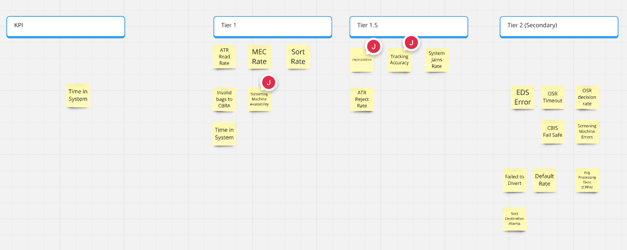
When designing the screens, we wanted to prioritize flexibility over rigid statistics, especially when it came to KPIs. Not every customer prioritizes the same stats and forcing a one-size-fits-all approach can limit usability. It also helps empower teams to customize the system to different operational goals, ensuring data presented is relevant and actionable for the end user.
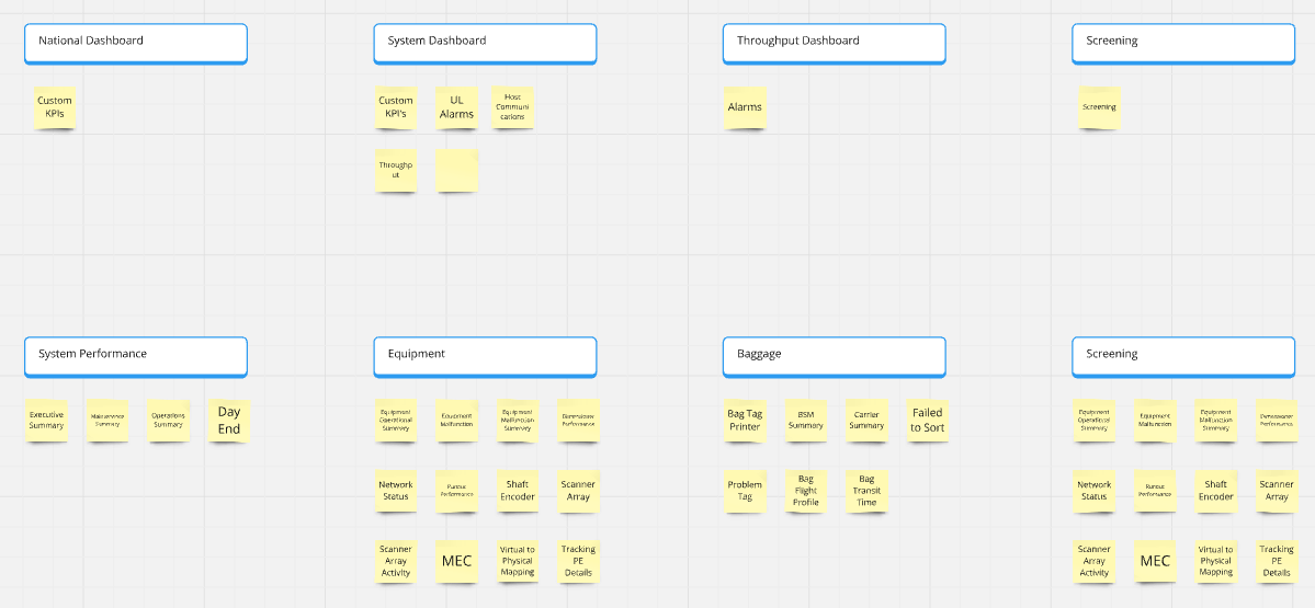
To that end, we've focused on building a framework that allows a select number of KPIs to be configurable to tailor them based on the customer's unique needs. To do so, we interviewed a few different Airlines and targeted high priority datasets that we found important to our SmartSort customers.
Given the complexity and scale of this project, usability test was essential to ensure the redesigned dashboard met user needs effectively especially with multiple workflows, diverse user roles and high-stakes decision making. For phase 1, we released it to our power users (United Airlines) to get feedback.
Problem
They wanted more information added to the National Dashboard; to be able to see high-level stats like bags expected and bags sorted.
Solution
Originally, it wasn't designed with more headroom in mind so I needed to redesign the layout in a way that incorporates the new data points. The challenge was more on structure than data this time.
Problem
Another key request was greater customization for filters, particularly for time range selection. Users wanted quicker adjustments to time periods and be able to keep the filter panel open persistently.
Solution
To address this, we explored a simple time range UI to allow users to quickly adjust periods without having to go through the hassle of selecting dates and time. On the technical side, we agreed to keep the filters expanded at all times specifically for United Airlines.
.png)
This dashboard redesign was a long and iterative process but I believe it proved to be successful and well-evaluated by our customers especially United Airlines. I remember being stuck and lost for many moments just trying to figure out where to start and how things were connected. This shows the importance of being able to do user research not just with customers but with internal stakeholders because they help provide different perspectives into the problem.
While delivered across multiple phases and teams, the outcome enabled the customer to:
Here were some future scope items that the team is looking into:

If you like what you see and want to work together, get in touch!
jeff.cylaw@gmail.com