DocHub wasn’t a “nice-to-have” product — it was built around the reality that maintenance teams operate in high-pressure environments where time spent searching for information becomes downtime, risk, or rework. The biggest challenge wasn’t that documentation didn’t exist. It was that documentation wasn’t consistently accessible, organized, or connected to the way technicians troubleshoot in the field.
A few constraints shaped the experience:
The goal was to create a single place (One-stop shop) where maintenance teams could reliably find parts/equipment documents for repair, while also improving how that is navigated and understood. To make the project measurable, I anchored the design around practical success criteria:
During early discovery, I conducted interviews with the maintenance team at American Airlines (DFW), supported by regular follow-up conversations throughout the project to verify that our design decision aligned with their needs. Technicians consistelnly described a workflow that followed a very linear pattern: conveyor → elevation drawing → sub assembly list → parts list. This workflow, however, wasn't supported by their current documentation strucutre, making it difficult to trace a problem from a system-level view.
The deeper insight was that documentation access isn't a single flow — it branches based on what a user knows at the moment they start:
These findings validated that technicians weren't just missing a central file repository — they were missing a system that respected how they think, how they work, and how their information flows.
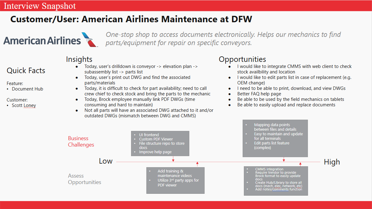
With the insights extrapolated, it became clear that the true problem wasn't just poor organization, it was a mismatch between the system's structure and the technicians mental model. Technicians don't browse aimlessly; they navigate using contextual anchors like conveyor identification, panels, and sub assemblies. Electrical teams focus on the system and PLC relationships; mechanical teams move spatially through converyors and device breakdowns.
To achieve this, DocHub needed to support:
This reframing shifted our design philsophy away from "file repository" toward "task support system".
As we moved into ideation, it became clear that supporting the unique workflows for each team required designing purpose-built UI structures that mirrored how each team thinks and works. That realization led us to build DocHub with three major components:
1. Document Library
2. Electrical Drawing Finder
3. Mechanical Drawing Finder
A major part of this design effort involved defining how information should be surfaced. Tables, for example, made it easy to scan part lists or metadata but they quickly broke down when users needed to explore nested information levels. A conveyor could contain dozens of sub assemblies, and each one could include tens of parts — flattening these into a table either created an overwhelming wall of data or buried information behind multiple layers.
Multiple tabs or pane layouts were considered but those risked shrinking the primary drawer view which was the most important element for technians to view. And modals were quickly ruled out because they blocked the entire drawing entirely, leading to constant context switching.
These explorations made the answer clear: the side drawer was the strongest pattern for DocHub. It allowed:
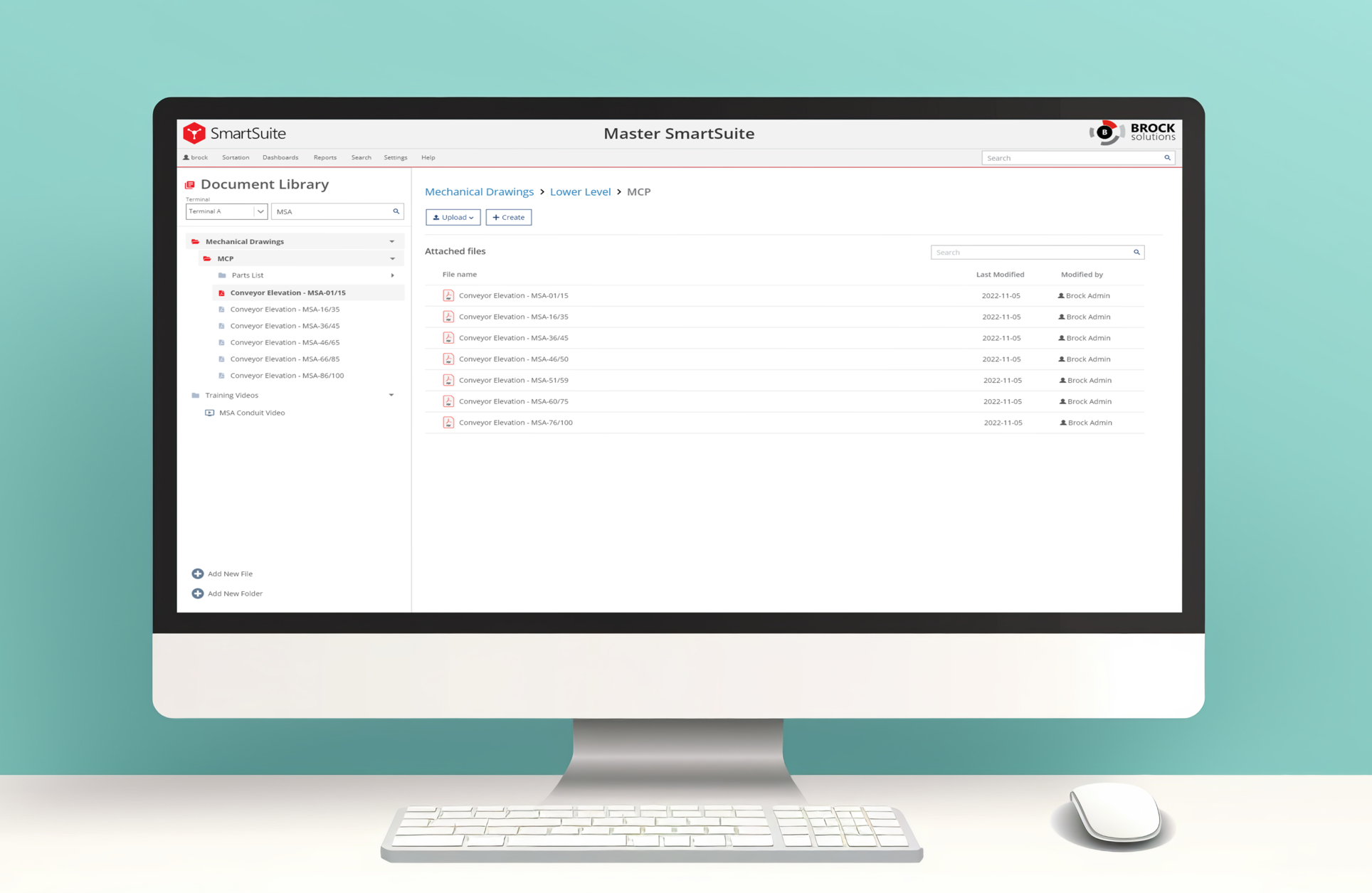
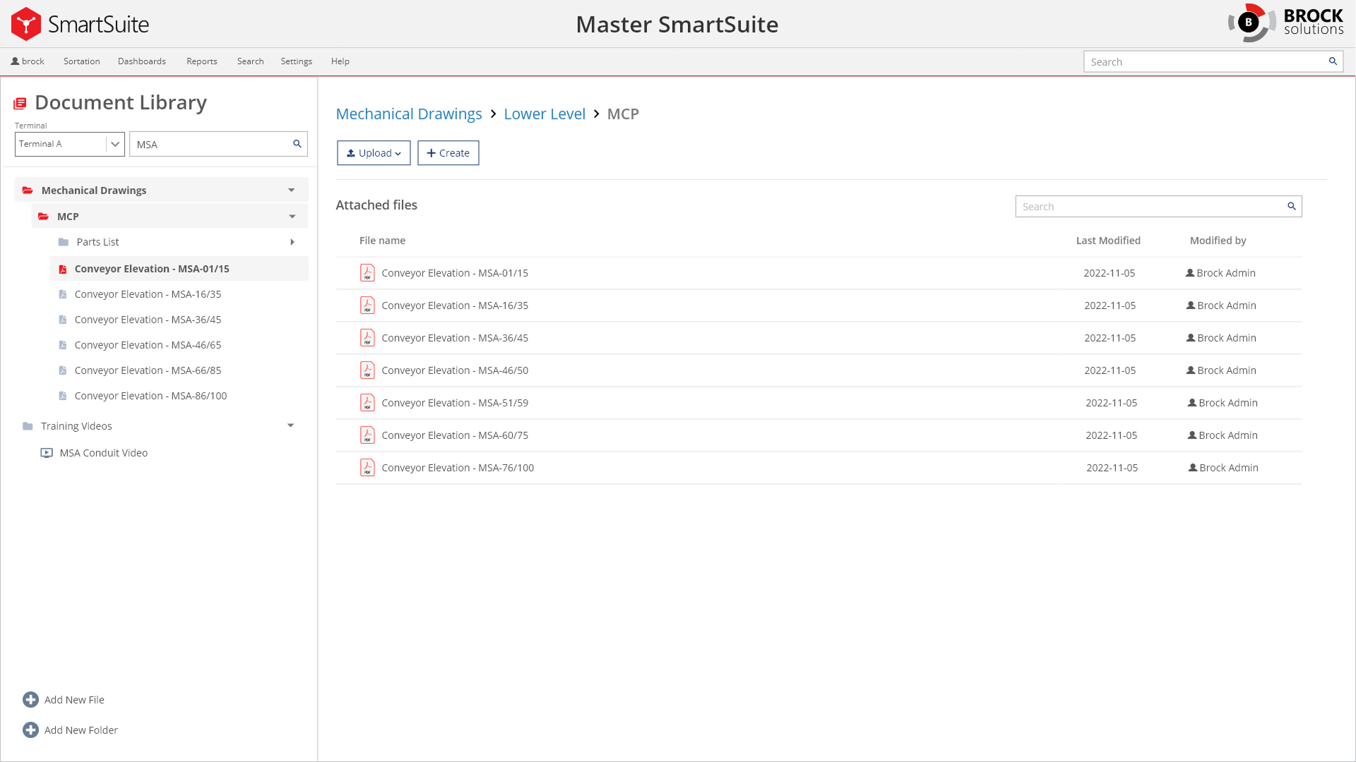
The Document Library isn't just a storage area — it directly addresses some of the biggest pain points discovered during user interviews and workflow observation. Previously, technicians were relying on physical documents with sticky notes or CDs that was simply inconsistent and messy to keep track of the latest updates. The library solves these issues by creating a centralized, structured environment where documentation is predictable, searchable, and most importantly maintainable.
One of the most significant improvements is native browser preview support for PDF's, MP4 videos, and common image formats, allowing technicians to view drawings, manuals, and training content without leaving the system. This was crucial because many users were jumping between multiple tools just to open files.
Another key improvement is structured version control, which allows users to replace files responsibly while providing reasons for updates and maintaining revision history. In additiojn with the built-in PDF mark-up tool, if a markup reflects a new procedure, a discovered discrepancy, the version history ensure the change is recorded.
.png)
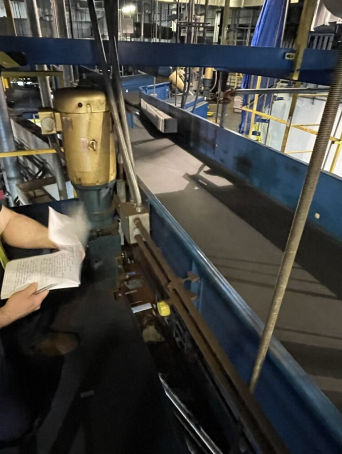
The Electrical Drawing Finder was designed to address one of the most time‑critical challenges uncovered during discovery: electrical technicians were spending too much time piecing together context from disconnected drawings, folders, and systems. Their workflow required flipping through hundreds of printed sheets or cross-checking information stored on separate discs.
Instead of requiring technicians to dig through nested folder structures or manually track down related diagrams, the Electrical Finder uses a filter‑first interaction model. By starting with what the user does know (Terminal → Conveyor → Panel), the system narrows the space instantly and loads exactly the drawing package they need.
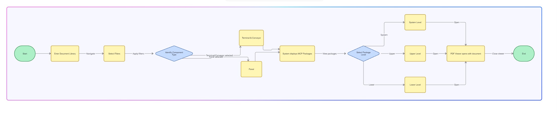

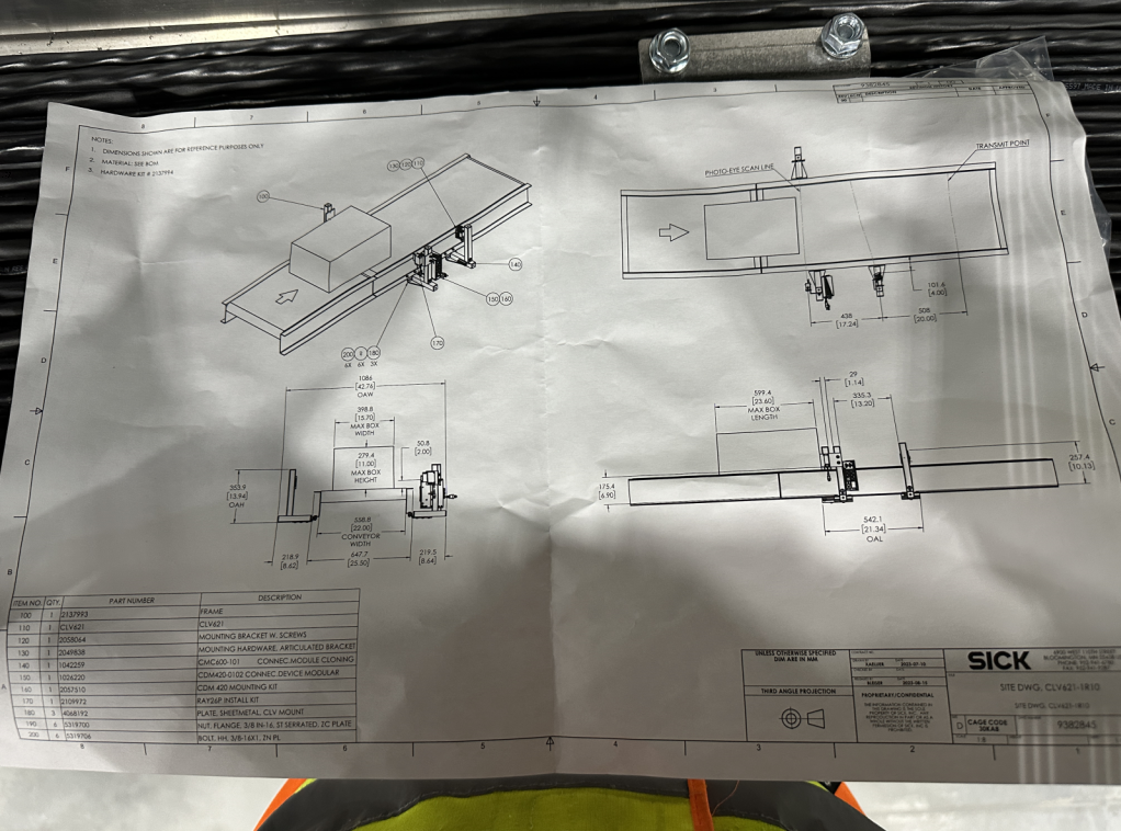
Mechanical technicians have a fundamentally different workflow — one that starts with the physical system, not documentation categories. The finder reimagines this process by instead of browsing folders, they begin with the terminal and conveyor, two pieces of information they nearly always know in the field. With that, the finder supports drill-down workflows that mirrors how technically actually troubleshoot: the full sub assembly list for a conveyor which can be further expanded to the parts that are associated.
.jpg)

There was a valid concern by the team that open access could lead to accidental uploads, file replacements, or unintended deletions that might compromise critical documentation. To prevent this, we approached permissions to allow edit and/or read-only for specific users. From a UX perspective, this also allowed technicans to stay focused on what they needed the most: quick, reliable access to the correct documents without being boggled by unneescary actions such as uploads or file reorganizations.
Throughout the project, we had regular design review meetings with the customr to ensure DocHub was aligned with their workflow and pain points. Because this was the team’s first transition from physical binders and CDs to a digital documentation system, validation wasn’t optional — it was essential. These sessions acted as continuous checkpoints where I shared prototypes and walked through updated flows.
To complement these reviews, I also conducted lightweight usability tests with several technicans from both electrical and mechanical teams who would actually use DocHub daily. I focused on task-based scenarios grounded in their real work to observe if the designed workflow matched their expectations.
These sessions revealed where we needed clearer labels, better grouping, or more consistent patterns. By testing early and often, we ensured the system wasn't just usable to executives, but rather it was intuitive to the daily users, reducing training overhead.
DocHub significantly improved technicians ability to find, understand, and act on documents. By anchoring navigation to the workflows of electrical and mechanical users, the system reduced friction and improved task efficiency to solving the real problems (e.g. troubleshooting and fixing devices ASAP). The result is a platform that finally matches the pace and pressure of real field conditions.
What makes this especially meaningful is how much teh solution evolved along the way. At the beginning of the project, it was difficult to image what the UI would look like because there were no pre-existing pattern and our current system components weren't capable of delivering the solution we needed. This realization pushed us to take a bold step: create new UI patterns that never existed in our system before. We also believed this new platform will be huge in the aviation industry as many other customers are still relying on physical documents.
If you like what you see and want to work together, get in touch!
jeff.cylaw@gmail.comSetting high-level goals: